Sketchbook Scans
These are scans from my development work. This has been a tough challenge in terms of selecting a particular visual language, given the many points of view the text can be perceived from.

This is an alteration of a character I designed back in the summer and at first I thought him to be the perfect character for what I had in mind. In the meantime, while designing the rest of the characters I produced some rather satisfying and some dissapointing results as well.
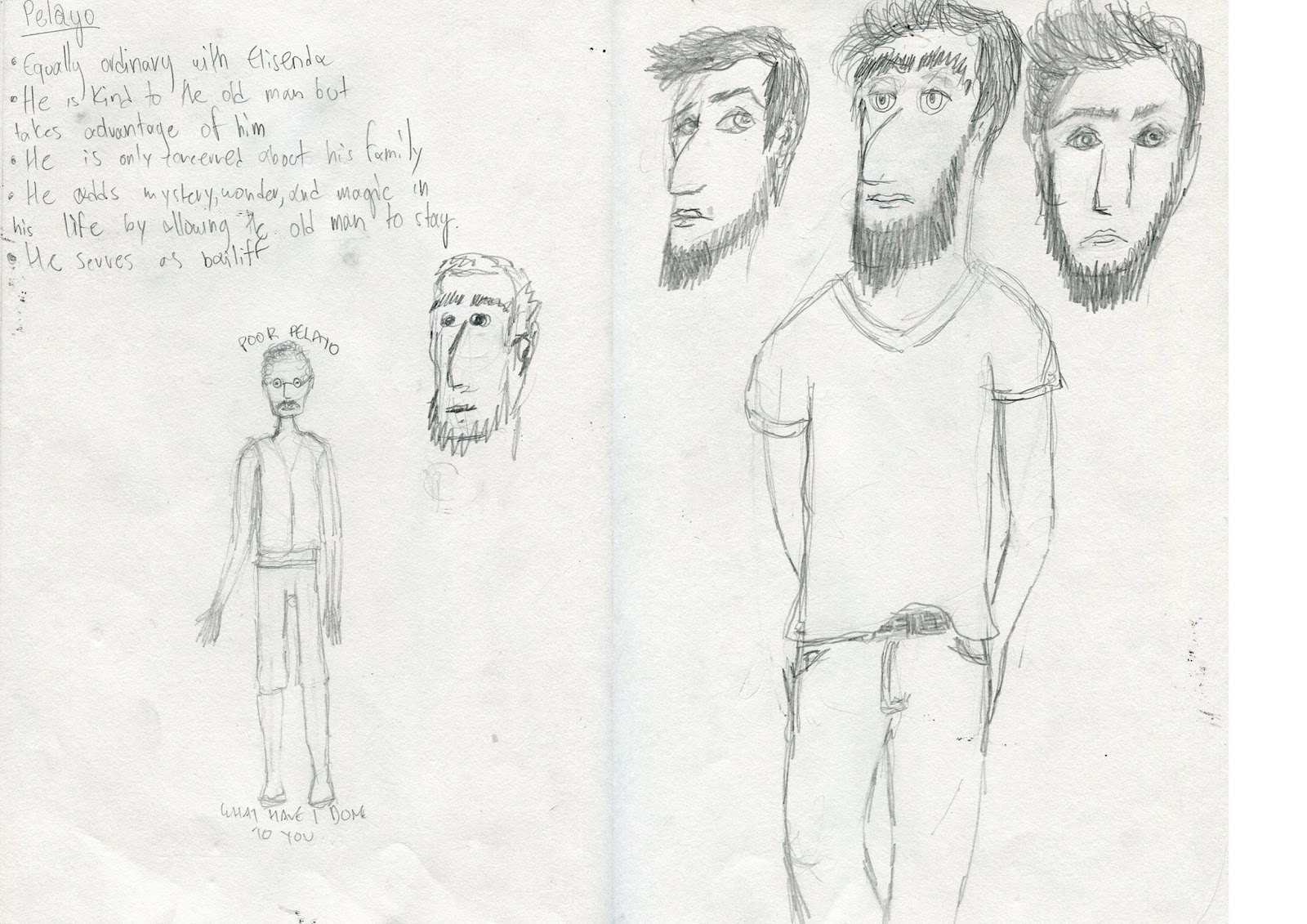
Wasn't particularly fond of Pelayo as a character, so I am not really surprised that I didn't have many ideas for him

This design of the spider woman kind of reminds me of Quentin Blake's characters, whose I am a huge fan. I had some problems trying to get her right from different angles, and I also couldn't find an interesting way to blend the head with the body.

I had many thoughts about father Gonzaga and tried to discover his background and have had some interesting and some rather ridiculous results.

Apart from the one on the left, I really liked my designs for the neighbour woman, but in the end I thought that a person who knows a lot about life and death should probably be much older than that.

Elisenda Is probably my favourite character of the story since I have found some connections between her character and reactions and mine. I wanted to base her in Ancient Greek Statues, and to be more precise of the goddess Estia, who was the goddess of Home, warmth and hospitality. Ironically, of course.

As I love literature, I couldn't help but proceed to analyze the literate aspects of the story in order to dig out hints and ideas that could determine the emotion and overall output of the artwork. This process really helped me a lot to gain a better understanding of the intentions of the author and the direction of the story.


I looked at possible page formats and then proceeded into splitting the story and numbering it in key events in order to better organize the facts that occurred and have an easier way to view the story as a whole and proceed to choosing what to illustrate.

next logical thing to do was to start storyboarding and stripping out my possible compositional ideas. Working in a small scale at first is really helpful when composing images since it really lets you see the page as a whole and not be distracted by things as the quality of the technique, color, or lines.

As always, there were some moments of inspiration and some moments of confusion, but in the end after interrogating myself and the text, I got the hints that I needed in order to proceed to the finals.


The thing I decided to do last was the cover design. I thought it was a good idea to do the rest first in order to be able to grasp a general sense of my illustrations and try to bring that sense out in the cover artwork. I believe that i have succeeded, even though some of the spreads included in my dummy do like they do not really "fit in" as well with the others.


The cover design I decided to work with in the end was the one on the right. Since the story starts "In medias res" I thought that it would be very interesting to try and guess, or more correctly, create an image that occurred before the narrative starts. It was only logical that the man must have fallen from the sky so I chose the safe option to illustrate him during his mid-fall.